WPF: Read-Only Selectable Text

|

In WPF making a read-only text area is easy, add a TextBlock, and then set the Text property. However, now imagine that you would like to enable your users to select the read-only text--a very common scenario--that's easy too. Create a TextBox, and then toggle the IsReadOnly property to True, job done, right?

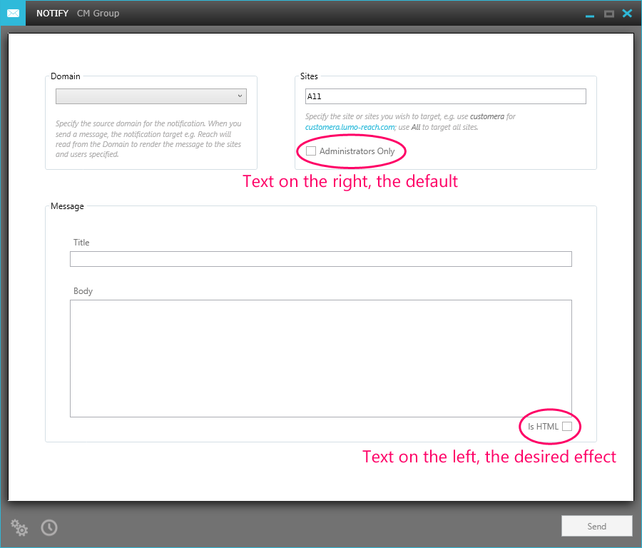
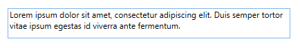
Depending on why you want the TextBox to be read-only this may not be enough. Typically I want a read-only TextBox not because I want TextBox where the text cannot be edited, but what I actually want is a TextBlock where the text can be selected; the difference between these two might not be obvious, so take a look at the following screen shot:

At the top is the TextBlock and bottom is a TextBox; the difference is that there is more chrome associated with the TextBox, which is rendering here as a grey border around the content; however, TextBlock does not provide the functionality to select the text, therefore we have to work with a TextBox. Happily the border is easily removed, set the BorderBrush property to {x:Null} and the border is all gone.

Unfortunately that is only a superficial fix--the illusion is ruined the moment you move your mouse over the TextBox; annoyingly the border returns but this time with the highlight colour. There is no toggle on the TextBox control to turn off that annoying behaviour :(


The good news is that this is not the end of the road; there are a couple of ways to fix this problem. The easiest I have found is to replace the control template for the TextBox. That may sound drastic, and not normally something I would encourage you to do to just change something as simple as this; the reason being the moment you change a template you now 'own' that code, and the less code you own the better.

So why is the TextBox different in this case? Well, first I need to explain a little bit about how control templates actually work, how the behaviour and look join together.

WPF controls, when first unveiled back in back in 2006, were described as 'lookless' controls. What that actually means is that the look of the control is divorced from the implementation of the control. By way of an example, take a Button control: the only behaviour required for a Button to be a Button is the Click event--beyond that everything else is considered the look.

WPF provides the mechanism for this approach to control building by using templates, specifically a ControlTemplate. Templates define the look for all sorts of things in WPF, be it a control, a piece of data, or a panel. Templates can be defined imperically but are typically defined declaratively, by using XAML. The behaviour is defined by using managed code--C# for example.

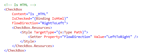
This all sounds lovely and gives a wonderful separation of concerns, however, there is an implmentation detail that requires an a element of pragmatism to make this system work in the real world. For some controls it is possible for the imperative code to know nothing of the declarative code and work cleanly through events and triggers; however, the moment a control gets even mildly complex there is a need for the imperative and declarative worlds to meet. When this is required the control author uses a naming convention by setting the x:Name attribute to PART_nnn; in the case of the TextBox the surface on which the text is to be rendered this element is called: PART_ContentHost. This then enables the imperative element of the control to reference to the visual and work its magic.

The upshot of all this for our scenario is this: so long as our template contains an element with the x:Name value of PART_ContentHost, we're golden:


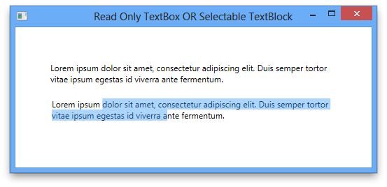
Here I have chosen a Border element, but you can use any Decorator or ScrollViewer derived elements. The result should be indistinguishable from a TextBlock with the exception that the text can be selected, as shown below:


So 'owning' the template in this case is trivial as the vast majority of the implementation for the control is hidden behind a single element, making for easy maintenance in comparison to a control with lots of moving parts.

If you have any comments, questions, flames, or enhancements I would love to hear from you. In the meantime, think deeply and enjoy.


WPF: Left Align Text in a CheckBox

|

The default text layout for a CheckBox is to position the text to the right of the box-chrome. During my development today I wanted to put that text to the left of the box-chrome.


This is a screenshot of the application I'm working on at the moment. At the top of the graphic you can see the default layout for a CheckBox is for the text to appear to the right of the box-chrome; at the bottom of the graphic is the effect I wanted with the text to the left of the box-chrome.

When looking around for a good way to achieve this result I came across many posts and articles that solved the problem by creating a new template for CheckBox, which manipulated the DockPanel container used in the template to position the chrome for the box and the text. While that approach works, and in some cases it may even be necessary, it does not need to be that hard.

By far the simplest solution is to use the FlowDirection property, and set the value to RightToLeft.


I must admit, that this is a fairly unintuitive approach to the problem, as FlowDirection is typically associated with localisation. However, as the help from Visual Studio states, the purpose of the property is to set the direction of the text within a parent element, which is all that is needed in this simple case.

This approach, however, while simple does introduce a new problem:


The check-mark also renders right-to-left, which is not what we want. To fix this you need to understand the CheckBox template a little, in the sense that the template uses a Path element to render the check-mark; armed with that information you can easily fix the problem with a Style scoped to just the CheckBox, as shown below:


Notice the FlowDirection for the CheckBox is RightToLeft, but I've overridden that with a Style in the CheckBox instance. Bingo! Job done, left-aligned text in a CheckBox, a little unintuitive but after you know the secret sauce, easy enough to do.

If you have any comments, questions, flames, or enhancements I would love to hear from you. In the meantime, think deeply and enjoy.


WPF: Dynamic Button Background

|

I have recently been asked the following question, paraphrasing a little:
How do I change the background brush of a Button based on the background of the container panel by using a key-less Style?
The short answer is that I would use a value converter to look at the background colour for the desired container, and then return a Brush based on that, here's the code for the converter:

This code expects the incoming value parameter to be of type Panel, if it is not, then the converter simply returns the system brush for a control background.

If the object is a Panel and the background brush is a SolidColorBrush then check for the target colour; Khaki in this case. If so, then change the background colour to Orange. If the container is correct, but the colour is not, then set the background colour to Khaki instead.

Note that I've baked the colours into this code to keep the sample simple, however, in a real world application all the brushes would be resources and the converter would use those instead.

The next step is to wire this converter in to the XAML:


First I've added the value converter to the mark-up by using an l: prefix, and then added the value converter to the resources. Next, I've create a default style for all Buttons, by not using a key for Style resource, and then created a Setter for the Background property. Next, I've use a RelativeSource markup extension, looking for parent panel type I care about, a Grid in this case in a Binding, finally applying the converter to the binding.

Next, I've added three buttons to the view, to prove the style works:
  1. A Button in a StackPanel acting as the layout root,
  2. A Button wrapped in a Grid, but with the default background colour,
  3. Finally, a Button wrapped in a Grid and with the target background colour
The output looks as follows:


And there you have it; dynamic Button backgrounds based on the parent Panel. You can download the code from here:
PaulJ.DynamicBackgrounds.Demo
I would like to point out that if the target object was to be a data object, e.g. a ViewModel or any model object, as opposed to a Button, I would use a different technique; in that case I would use a DataTemplateSelector or a DataTrigger. If anyone is interested in seeing that code then please leave me a comment and I'll put something together.

That's it for now, and as usual, if you have any comments, questions, flames, or enhancements I would love to hear from you. In the meantime, think deeply and enjoy.


Older Posts Home